Unveiling the Secret Influence of Titles: How the Right Words Shape Our Perception of Line Charts
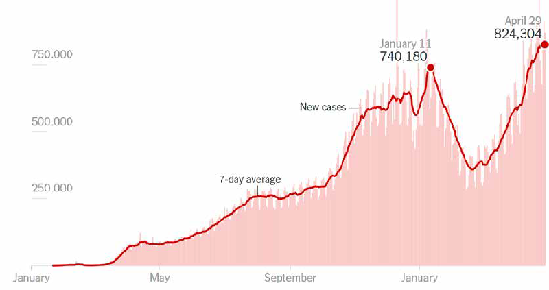
A recent study from the University of Oklahoma sheds light on a pivotal yet often overlooked aspect of data visualization: the power of chart titles. Conducted by researchers Jasmine Lim, Tapendra Pandey, Ghulam Jilani Quadri, alongside collaborators from UNC-Chapel Hill and POSTECH, the research investigates how the wording and nature of titles can dramatically influence viewer interpretation of line charts.
The Importance of Titles in Visual Representation
With the proliferation of visual data communication in the digital age, line charts have become a staple for conveying trends and patterns across various platforms. However, the brief time viewers spend analyzing these visuals necessitates that they form rapid conclusions based on how the information is framed. This study underscores the idea that the title of a line chart is not merely a label; it acts as a cognitive guide that helps viewers form quick takeaways.
What the Research Found
The researchers invited participants to view a series of 50 line charts, each with different title characteristics—varying in word count and intended emotional message. The results were telling: both the length of the title and the emotional tone significantly impacted how patterns were identified. For instance, participants consistently reported their interpretations were aligned with the patterns suggested by longer, more descriptive titles, demonstrating that titles play a crucial role in shaping viewer perception.
Visual Structure vs. Textual Framing
Interestingly, the study revealed that while titles help guide interpretations, the visual structure of the charts themselves also possesses a powerful influence. Participants frequently identified visual trends such as peaks and troughs based on these structures, sometimes even over the cues provided by the titles. Charts with prominent visual features often saw participants converge on a single interpretation, while those with less clear visual cues yielded a range of responses, emphasizing the interaction between textual and visual information.
Implications for Future Visualizations
The findings from this research advocate for a more thoughtful approach to designing titles in data visualizations. As the study emphasizes, titles that are informative and context-rich not only clarify but also enhance the viewer's comprehension of the data presented. Future work is encouraged to dive deeper into the interplay of various textual elements beyond just titles, ensuring that visualizations engage and inform effectively.
In summary, this study highlights a crucial aspect of data communication that could transform how information is visually presented. The right title can mean the difference between clarity and confusion, underscoring the critical role of effective wording in facilitating better understanding in data interpretation.
Authors: Jasmine Lim, Tapendra Pandey, Arran Zeyu Wang, Sungahn Ko, Ghulam Jilani Quadri