Unlocking the Power of Titles: How Title Framing Shapes Our Understanding of Line Charts
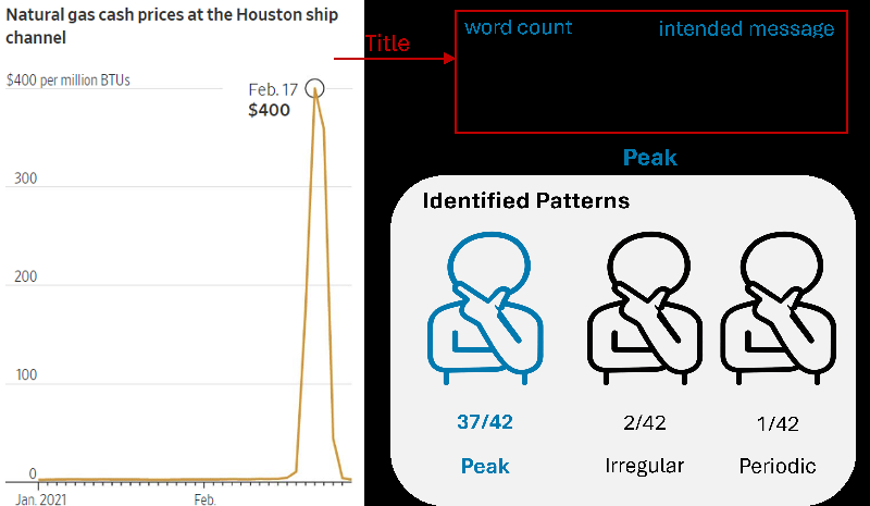
In a world saturated with data and information, the way we present that data can drastically change its interpretation. A recent study conducted by researchers from the University of Oklahoma and the University of North Carolina at Chapel Hill sheds light on an often overlooked aspect of data visualization: the influence of title framing on our ability to identify patterns in line charts.
The Importance of Titles in Data Communication
Line charts are a common staple in online news, used to illustrate trends over time. However, the effectiveness of these charts doesn’t solely rely on their visual appeal. The titles accompanying these charts play a critical role in guiding how viewers interpret the information presented. The research found that varying the word count and intended message of a title could significantly alter a viewer’s pattern identification.
What Did the Study Investigate?
The study involved 47 participants who were shown 50 line charts from reputable news sources and asked to identify the patterns they perceived. The charts were analyzed based on two main characteristics of their titles: word count (categorized as low, medium, or high) and intended message (neutral, statistical, or affective). For instance, an affective title might evoke emotions, while a neutral title simply describes the data without additional framing.
Key Findings: Patterns and Title Framing
The results were revealing—titles with a higher word count and those that employed emotional language led to better alignment between what viewers identified and what the chart intended to convey. This highlights that a well-crafted title can serve as a powerful cue, actively shaping the viewer's perception of the data.
Interestingly, the study also emphasized the role of visual structure in aiding pattern identification. Even when titles were neutral or short, a chart with a prominent pattern could still effectively communicate its message. This suggests that while titles are essential, the visual nature of the chart itself cannot be underestimated.
Implications for Effective Visualization
As the study illustrates, data designers should carefully consider how titles are framed to enhance understanding and communication. A thoughtful combination of informative titles and strong visual elements can significantly improve how audiences engage with data visualization.
The implications of this research extend beyond academic settings; they offer practical guidelines for journalists, teachers, and anyone tasked with presenting data. By understanding how title framing affects pattern identification, we can create clearer, more impactful data presentations that resonate better with our audiences.
Looking Ahead
Future research is encouraged to explore even broader aspects of textual characteristics in visualizations, which could lead to comprehensive design frameworks that enhance data interpretation across various contexts. Such advancements can unlock the full potential of data visualization, ensuring that vital insights reach the audience effectively and meaningfully.
This groundbreaking study presents a compelling call to action for all who communicate with data: never underestimate the power of a title!